CSS 3D Rotation Examples
By Stephen Bucaro
It is truly amazing what the latest CSS specifications allows you to do do in a browser.
CSS level 3 defines 2D and 3D transforms and one of those transforms is 3D rotations.
But before you can use any 3D transforms, or even 2D transforms for that matter, you
need to understand the Cartesian coordinate system.
The Cartesian coordinate system specifies each point in a plane by a pair of numerical
coordinates, x and y. The origin of the coordinate plane is located at x=0,y=0. The
x axis runs horizontally with numbers increasing from left-to-right. The y axis runs
vertically with numbers increasing from bottom to top.

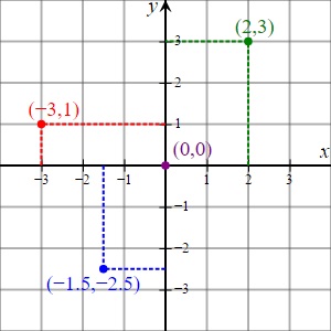
The diagram above shows four points on the Cartesian coordinate plane marked with their
coordinates: (2, 3) in green, (-3, 1) in red, (-1.5, -2.5) in blue, and the origin
(0, 0) in purple.
Of course, we live in a 3 dimensional universe, which means we also have a third axis,
the z axis, that runs transversely to the 2D coordinate plane, in other words from
in-to-out, or in-your-face so to speak.

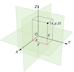
The diagram above shows a point in 3D space with coordinates x = 2, y = 3, and
z = 4, or (2, 3, 4).
Rotate Around a Single Axis
transform: rotateX(angle) defines a rotation around the X axis.

<img style="transform: perspective(500px) rotateX(45deg)" border="0" width="200" height="200" src="images/scott_c41.jpg" />
In the example above, the image is rotated 45 degrees around the X axis. Note that the
rotation direction is clock-wise if you're facing the X axis looking left towards the origin.
The perspective property enhances an elements 3D appearance. It creates a
vanishing point effect. The value of perspective defines how many pixels a 3D element
is placed from the view. Lower values for perspective enhances the 3D effect and places
the object more in-your-face.
| 
