How to Make Images Responsive
By Stephen Bucaro
Normally images on a webpage have a have a fixed width and height. But with today's
widespread use of mobile devices, you might want to use a little easy style code to make
them adjust their size if your webpage is displayed on a small mobile smartphone screen.

<!DOCTYPE html>
<html>
<head>
<meta charset="UTF-8">

<style>
img
{
width: 100% ;
height: auto;
}
</style>

<title></title>
</head>
<body>

<img src="hibiscus.jpg" />

</body>
</html>
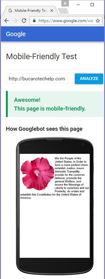
The code shown above creates a webpage that reduces or increase the image's width to be the same width
as the webpage, and reduces or increase the image's height the same proportion.
<!DOCTYPE html>
<html>
<head>
<meta charset="UTF-8">

<style>
#half
{
float: right;
width: 50%;
height: auto;
}
</style>

<title></title>
</head>
<body>

<img id="half" src="hibiscus.jpg" />

</body>
</html>
The code shown above creates a webpage that reduces or increase the image's width to be half the width
as the webpage, and reduces or increase the image's height the same proportion. By default the image
would end up on the left side of the page, but the style float: right; causes it to be on
the right side of the page.
| 
