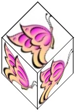
CSS Arts and Crafts - Create a Graphic Cube Using the CSS3 Transform Property
By Stephen Bucaro
When the web first started, back in 1990, it was based on simple HTML (HyperText Markup Language).
It was used to send text and tabular data between universities and research institutes. I think
it didn't even allow images until near the end of 1995 when HTML version 2.0 was released. But
the general Internet developing public wanted to create fancy magazine-style webpages, so a year
later CSS (Cascading Style Sheets) was released.
Today we're at CSS version 3, and although it's overly complicated and it takes a long - long
time to master it, the power it gives you, as a designer, is amazing. And, although I hate to
admit it because I'm so far behind schedule on my projects, sometimes I just toy around with CSS
to see what it can do. That's what I was doing when I came up with this:

The CSS3 transform property allows you to rotate, scale, move, and skew html elements. I've used
transform:skew previously to slant text. I've seen many examples of transform:skew
used to skew divs with colored backgrounds. But can it be used to skew a div with
an image background? That seems unlikely because the code to manipulate a graphic to perform
that function would be somewhat complicated.
But guess what - yes it can skew an image. On one hand, I'm amazed, but on the other hand, I think
CSS has gone too far. Having these types of capabilities built-in to a web browser, in my opinion,
makes it bloated and slow. But if you want to play around with it, here's the code:
<!Doctype html>
<html lang="en">
<head>

<style>
#top
{
background-image:url('butterfly.jpg');
position:absolute;
left:280px;
top:141px;
width:60px;
height:60px;
-ms-transform:skew(45deg,-45deg); /* IE 9 */
-webkit-transform:skew(45deg,-45deg);  /* Chrome, Safari, Opera */
transform:skew(45deg,-45deg);
}
#left
{
background-image:url('butterfly.jpg');
position:absolute;
left:250px;
top:200px;
width:60px;
height:60px;
-ms-transform:skew(0deg,45deg);
-webkit-transform:skew(0deg,45deg);
transform:skew(0deg,45deg);
}
#right
{
background-image:url('butterfly.jpg');
position:absolute;
left:309px;
top:200px;
width:60px;
height:60px;
-ms-transform:skew(0deg,45deg);
-webkit-transform:skew(0deg,45deg);
transform:skew(0deg,-45deg);
}
</style>

</head>
<body>

<div id="top"></div>

<div id="left"></div>

<div id="right"></div>

</body>
</html>
Note in the code that I used position:absolute; and then specified a left:, top:, width:,
and height: location. Setting position to absolute takes the s out of flow,
places them on their own layer, and explicitly position them. To position the divs to make a cube, you
need to understand the layout of the screen, That is, Xpixel locations from from left-to right,
Y pixel locations run from top to bottom. The syntax of the skew method is shown below.
transform:skew(Xdeg,Ydeg);
|

