

Although visualization can help clarify and communicate your data's meaning, you need to make sure that the data insights you're communicating are correct - that requires great care and attention in the data analysis phase. Here are a few free tools that you can use for some advanced data analysis tasks.
Talking about Tableau Public
Tableau Public is a free desktop application that aims to be a complete package for chart-making. If the name sounds familiar, it may be because Tableau Public is just the free version of the popular Tableau Desktop program. As part of the freeware limitation, the application doesn't let you save files locally to your computer. All of your work must be uploaded to Tableau Public's cloud server, unless you purchase the software.
Tableau Public creates three levels of document - the worksheet, the dashboard, and the story. In the worksheet, you can create individual charts from data you've imported from Access, Excel, or a text-format .csv file. You can then use Tableau to easily do things such as choose between different data graphic types or drag columns onto different axes or subgroups.
WARNING: You have to deal with a bit of a learning curve when working with the flow of the application and its nomenclature - for example, dimensions are categorical data and measures are numeric data.
Tableau offers many different default chart types - bar charts, scatterplots, line charts, bubble charts, Gantt charts, and even geographical maps. Tableau Public can even look at the type of data you have and suggest types of charts that you can use to best represent it. For example, imagine you have two dimensions and one measure. In this situation, a bar chart is a popular choice because you have two categories of data and only one numeric measure for those two categories.
But if you have two dimensions and two measures, a scatterplot might be a good option because the scatterplot data graphic allows you to visualize two sets of numerical data for two categories of data.
You can use a Tableau dashboard to combine charts with text annotations or with other data charts. You can also use the dashboard to add interactive filters, such as checkboxes or sliders, so that users can interact with your data to visualize only certain time series or categories. With a Tableau story, you can combine several dashboards into a sort of slideshow presentation that shows a linear story revealed through your data.
You can use Tableau Public's online gallery to share all of the worksheets, dashboards, and stories that you generate within the application. You can also embed them into websites that link back to the Tableau Public cloud server.
Getting up to speed in Gephi
Remember back in school when you were taught how to use graph paper to do math and then draw graphs of the results? Well, apparently that nomenclature is incorrect. Those things with an x-axis and y-axis are actually called charts. Graphs are actually network topologies.
Gephi is an open-source software package you can use to create graph layouts and then manipulate them to get the clearest and most effective results. The kinds of connection-based visualizations you can create in Gephi are very useful in all types of network analyses - from social media data analysis to an analysis of protein interactions or horizontal gene transfers between bacteria.
To illustrate a network analysis, imagine that you want to analyze the interconnectedness of people in your social networks. You can use Gephi to quickly and easily present the different aspects of interconnectedness between your Facebook friends.
So, imagine that you're friends with Alice. You and Alice share 10 of the same friends on Facebook, but Alice also has an additional 200 friends with whom you're not connected. One of the friends that you and Alice share is named Bob. You and Bob share 20 of the same friends on Facebook also, but Bob has only 5 friends in common with Alice. On the basis of shared friends, you can easily surmise that you and Bob are the most similar, but you can use Gephi to visually graph the friend links between yourself, Alice, and Bob.
To take another example, imagine you have a graph that shows which characters appear in the same chapter as which other characters in Victor Hugo's immense novel Les Miserables. (Actually, you don't have to imagine it; the following figure shows just such a graph, created in the Gephi application.) The larger bubbles indicate that these characters appear most often, and the more lines attached to a bubble, the more he or she co-occurs with others - the big bubble in the center-left is, of course, Jean Valjean.
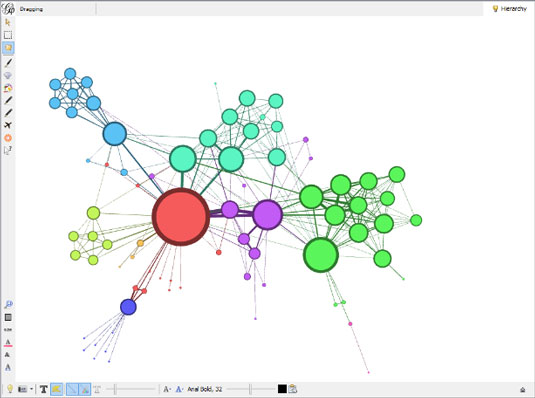
When you use Gephi, the application automatically colors your data into different clusters. Looking to the upper-left, the cluster of characters in blue (the somewhat-darker color in this black-and-white image) are characters who mostly appear only with each other (they're the friends of Fantine, such as Felix Tholomyes - if you've only seen the musical, they don't appear in that production). These characters are connected to the rest of the book's characters through only one character, Fantine. If a group of characters appear only together and never with any other characters, they'd be in a separate cluster of their own and not attached to the rest of the graph in any way.
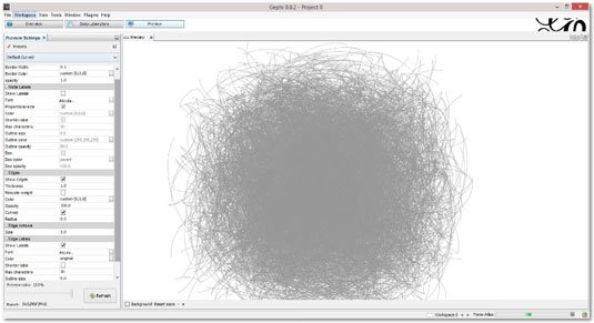
To take one final example, check out the following figure, which shows a graph of the United States power grid and the degrees of interconnectedness between thousands of power-generation and power-distribution facilities. This type of graph is commonly referred to as a hairball graph, for obvious reasons. You can make it less dense and more visually clear, but making those kinds of adjustments is as much of an art as it is a science. The best way to learn is through practice, trial, and error.
Machine learning with the WEKA suite
Machine learning is the class of artificial intelligence that's dedicated to developing and applying algorithms to data, so that the algorithms can automatically learn and detect patterns in large datasets. Waikato Environment for Knowledge Analysis (WEKA) is a popular suite of tools that is useful for machine learning tools. It was written in Java and developed at the University of Waikato, New Zealand.
WEKA is a standalone application that you can use to analyze patterns in your datasets and then visualize those patterns in all sorts of interesting ways. For advanced users, WEKA's true value is derived from its suite of machine-learning algorithms that you can use to cluster or categorize your data.
WEKA even allows you to run different machine-learning algorithms in parallel to see which ones perform most efficiently. WEKA can be run through a graphical user interface (GUI) or by command line. Thanks to the very well-written Weka Wiki documentation, the learning curve for WEKA isn't as steep as you might expect for a piece of software this powerful.

Find the right big data solution for your business or organization
Big data management is one of the major challenges facing business, industry, and not-for-profit organizations. Data sets such as customer transactions for a mega-retailer, weather patterns monitored by meteorologists, or social network activity can quickly outpace the capacity of traditional data management tools. If you need to develop or manage big data solutions, you'll appreciate how these four experts define, explain, and guide you through this new and often confusing concept. You'll learn what it is, why it matters, and how to choose and implement solutions that work.
• Effectively managing big data is an issue of growing importance to businesses,
not-for-profit organizations, government, and IT professionals
• Authors are
experts in information management, big data, and a variety of solutions
•
Explains big data in detail and discusses how to select and implement a solution, security
concerns to consider, data storage and presentation issues, analytics, and much more
•
Provides essential information in a no-nonsense, easy-to-understand style that is empowering
Big Data For Dummies cuts through the confusion and helps you take charge of big data solutions for your organization.
