Flat Styles - The Future of Web Design?
By Rahul Ranjan Singh
There is virtually no design element which offers a more meaningful shape to
minimalism than what flat designs do. Their earliest history can be traced back
to the times when designers felt that there was an urgent need to replace the
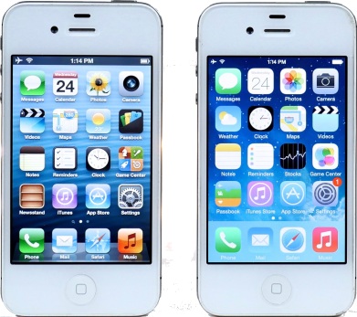
much popular skeumorphic style. Skeumorphism can very simply be described
as a design concept which entails the representation of design items that resemble
their real-world counterparts.

IOS 6 skeumorphic style vs IOS 7 flat style
Flat styles were definitely viewed as an answer to the limitations of skeumorphism.
If the digital space had difficulty in accommodating the skeumorphic elements,
the flat style was seen as a greater fit for the digital landscape with all its
(the digital landscape's) limitations. Today flat styles are regarded as one of
the most dominant trends ruling web design. So, if you are in talks with a website
designing company regarding the possible layout of your website, you should ideally
expect them to know about flat designs. Here is more about them.
Flat styles look great when they are rendered within the restraints of
minimalism but they are definitely adept at handling a considerable degree of
complexities as well. At the very core of these styles is artistic minimalism.
The immediate benefits of employing this particular style have been listed below:
Flat designs are compatible with responsive requirements
Since they are backed by structured and crisp visuals, they render an overall touch
of visual maturity that hardly any other web layout can guarantee
Speedy loading times
Easy user navigation
Typography is simple, which in turn, facilitates readability
Today we have flat 2.0, which adds complexity to minimalistic layouts. While the
older versions avoided the "grandeur" of shading, the new version employs it
effortlessly. Today, flat layouts have embraced more dynamic colors or bright
hues to compensate the lack of visual effects that its earlier versions were known
for. The modern flat styles employ a string of energizing colors contrasted with
a few dull elements in a bid to create a more engaging user experience.

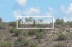
Ghost button
The typography of this particular kind of layout consisting of sans serif and
uniform stroke width remains simple and easy to read as well. It should not really
be forgotten that designers put particular emphasis on readability while working
with this particular style. The ghost button has emerged as almost a regular
feature of this particular layout. It works well with the overall nature of this
layout since it doesn't scream for attention but is there to facilitate user experience as well.
Webpulse Solution Pvt Ltd, an award winning web designing company in Delhi, is
offering affordable web solutions. We are offering
Web Development at very competitive rates.
More General Web Design:
• Why Wireframes Are Important in Website Design
• Creating an Effective Web Site
• How to Create a Website
• What is a Captive Portal?
• The Ten Parts of a Business Website
• How To Build A Web Site That Sells
• Ten Reasons Why a Facebook Page is Not a Replacement for a Professional Business Website
• Types of Mobile Website Design
• Website Blunders of Even Top Designers!
• How to Make a Free Website on Webs.com
| 
