Create a Cool Picture Frame Effect with CSS
By Stephen Bucaro
By setting the CSS border-color property to a transparent color, and setting the background-origin
property to border-box you can create a cool picture frame effect. Setting the background-origin
property to border-box causes the upper-left corner of the background image to be in the upper-left
corner of the border.

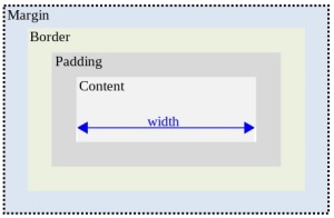
In the W3C box model, the width and height that you specify refers only to the content area of the box.
So if you use background-origin:border-box to move the upper-left corner of your image to the upper-left
corner of the boarder, you have to subtract 2 x the border-width from the width and height
of your image to get the width and height of the box.
<style>
#div2
{
width:260px;
height:356px;
border-style:solid;
border-width:50px;
border-color:rgba(0, 0, 0, 0.2);
margin:0 auto;
padding:0px;
background-image:url('riparion_3.jpg');
background-repeat:no-repeat;
background-origin:border-box;
}
</style>

<div id="div2"></div>
For example the image shown above has a width of 360px and a height of 465px, so after specifying
a border-width of 50px, I have to set the box width to 260px, and the box height to 356px.
Note the use of the background:url method to load the image, and the use of rgba to
specify a border color of black with an alpha parameter of 0.2 (alpha is a number between 0.0 (fully
transparent) and 1.0 (fully opaque).
More Easy Cascading Style Sheets:
• Easy CSS Tabbed Navigation
• Easy CSS Popup Windows
• Add Background Color to a Heading
• Code to Move the Scrollbar to the Left Side
• How to Color Alternating Rows or Columns in a Table
• Add Drop Shadows to Your Pictures
• CSS to Use an Image as a Mask
• Create CSS Button Rollovers
• Easy CSS 3D Mouse-over Pressed Text Effect
• How to Style a Table
| 
