One of the main differences between humans and other animals is that humans have a written language. Having a written language not only allows humans to communicate better, but also to transfer knowledge between generations. Written language started out with the desire to communicate information about the type of game animals encountered on a hunting trip. The pictures of the animals that were drawn on cave walls were preserved for us to view today. In other words, some cave man has communicated information about the type of animals encountered on a hunting trip 40,000 years ago.
Of course, all people are not great artists, and some of these cavemen's drawings were crude, more symbolic than realistic. Around 4,000 years ago, in an attempt to standardize these crude drawings, some Egyptian invented hieroglyphics. This written language was later improved, first by the Phoenicians, then by the Greeks. The English alphabet was developed from the Greek written language.
The first movable type was invented by Johannes Gutenberg in 1439. One problem with movable type was, back then they didn't have the greatest quality ink, and sometimes the ends of the letters didn't print correctly. In order to get more ink on the ends of the letters, an extra element called a serif was designed into the ends of the letters.
A typeface is a design of a letter, which may or may not include serifs. After reliable printing was achieved, people wanted to get more artistic with the design of letters, and today there are thousands of fancy typefaces. A complete alphabet designed with the same typeface is called a font.
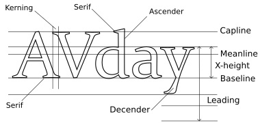
There are hundreds of terms used to describe the dimensions and construction of typefaces. Here some basic typography terminology is provided to help you understand the most commonly used terms.

| Capline | The line that marks the top of capital letters |
| Baseline | The line on which most letters sit |
| Ascender | A part of a lowercase letter that rises above the main body of the letter |
| Descender | A part of a letter that extends below the baseline |
| X-Height | The height of lowercase letters disregarding ascenders and descenders |
| Meanline | Half the distance from the baseline to the cap height. This may or may not be the same as the x-height, depending on the design of the typeface |
| Tracking | The normal regular spacing between characters in a section of text |
| Kerning | The horizontal spacing between two consecutive characters. Adjusting the kerning between between certain letters, like W and M, reduces gaps of white space and creates a more uniform appearance |
| Leading | The vertical spacing between lines of text from baseline to baseline |
| Serif | A decorative line or shape used to finish off a main stroke of a letter. A typeface without serifs is called sans-serif |
If you want to design your own custom typeface and font, you might start by drawing it on graph paper, or using a vector graphics application. There are also dedicated typeface and font design applications. There are also thousands of free fonts available on the Web.
More Graphics Design Tips:
• Introduction to Draw SVG Free Online SVG Drawing Application
• Inkscape - How to Use Bitmap Image Fill Pattern
• SVG Image Clipping
• Inkscape - How to Join Two Segments at Endnodes
• Export Inkscape Drawing as an Image
• Inkscpe Snap Controls Bar
• Building an Image with a Logo
• How to Create a Game App
• Create Animated Glistening Gold Text With SVG
• RGB Vs CMYK

